Designing for trust in a ₦1,000,000 transfer
An exploration of how Cardtonic could help people feel informed and in control when sending money.
The question behind the work
Cardtonic brings gift-card trading, bill payments and a wallet into one product. When I explored Cardtonic in early September, P2P transfers weren’t available in the app I was using. I explored how that capability could fit into its existing wallet, with a particular focus on what would help someone feel confident sending ₦1 million.
My work covered the research, transfer flow, interface and interactive prototype. I wanted the sender to understand each decision, have room to check it and know what happened to their money afterwards.
Looking beyond the transfer screen
I considered trust before, during and after payment. Clear onboarding, reliable service and responsive support all influence whether someone is comfortable moving money through a product.
For this exploration, I assumed an existing relationship with Cardtonic, completed identity checks and sufficient balance and transfer allowance. That let me focus on the moments within the payment where the design could support confidence or introduce uncertainty.
Learning from other payment products
I studied how other payment products approached recipient selection, amount entry and payment requests. I was interested in how they helped someone understand and control the transaction.
Grey returned a name after a tag lookup. Risevest let the sender confirm or reject the person, while Pocket distinguished similar handles. These examples informed how I presented the recipient’s identity beyond a username.

OPay’s recents and Chime’s contact groups offered shorter routes to familiar people. OPay also paired an amount with a magnitude label, giving me a useful reference for making a large value easier to inspect.


Cash App and Venmo showed how paying and requesting could share interaction patterns. I used that in the request-money exploration while keeping the payer’s decision separate from the requester’s action.

Bringing the findings into Cardtonic
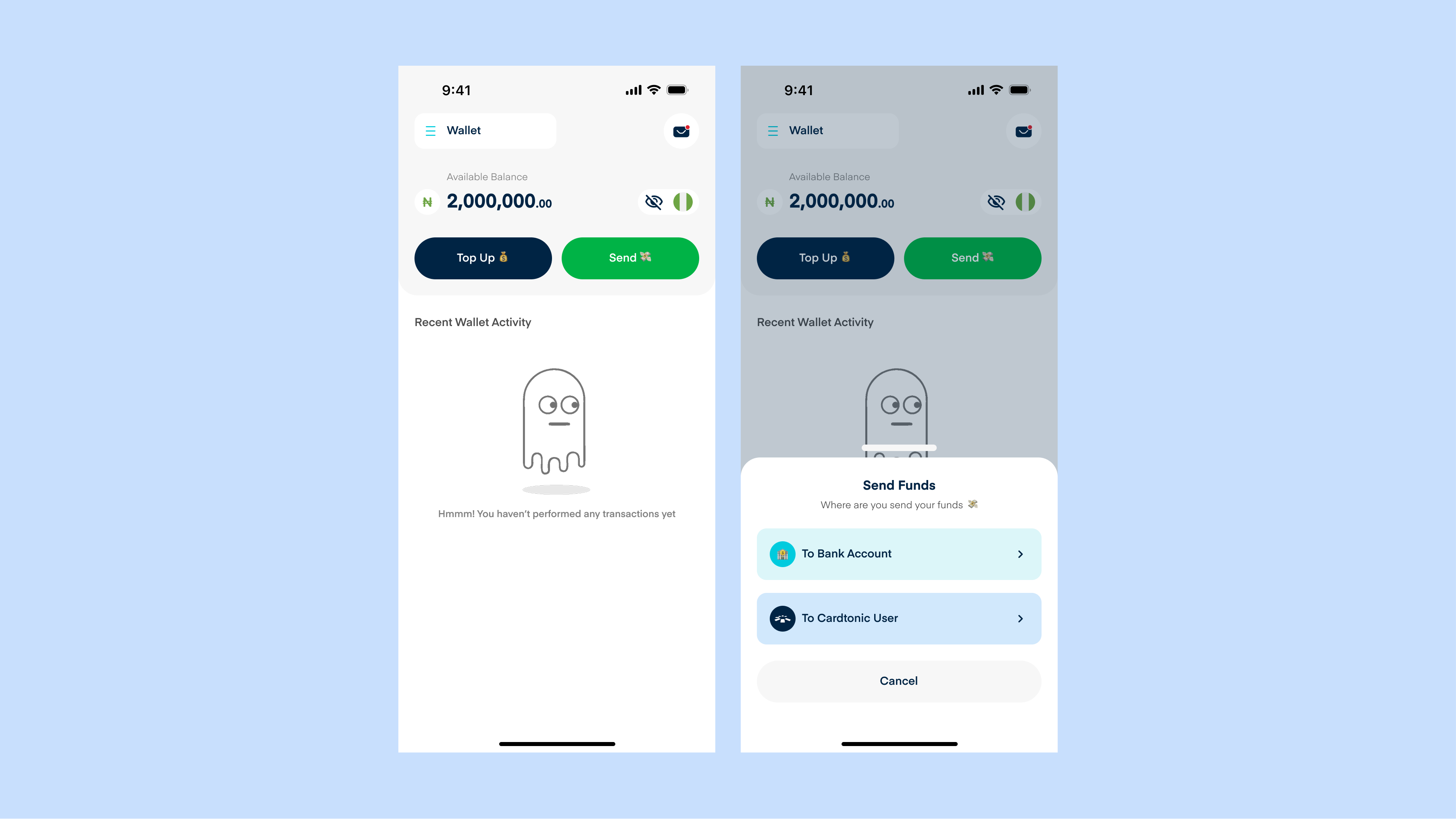
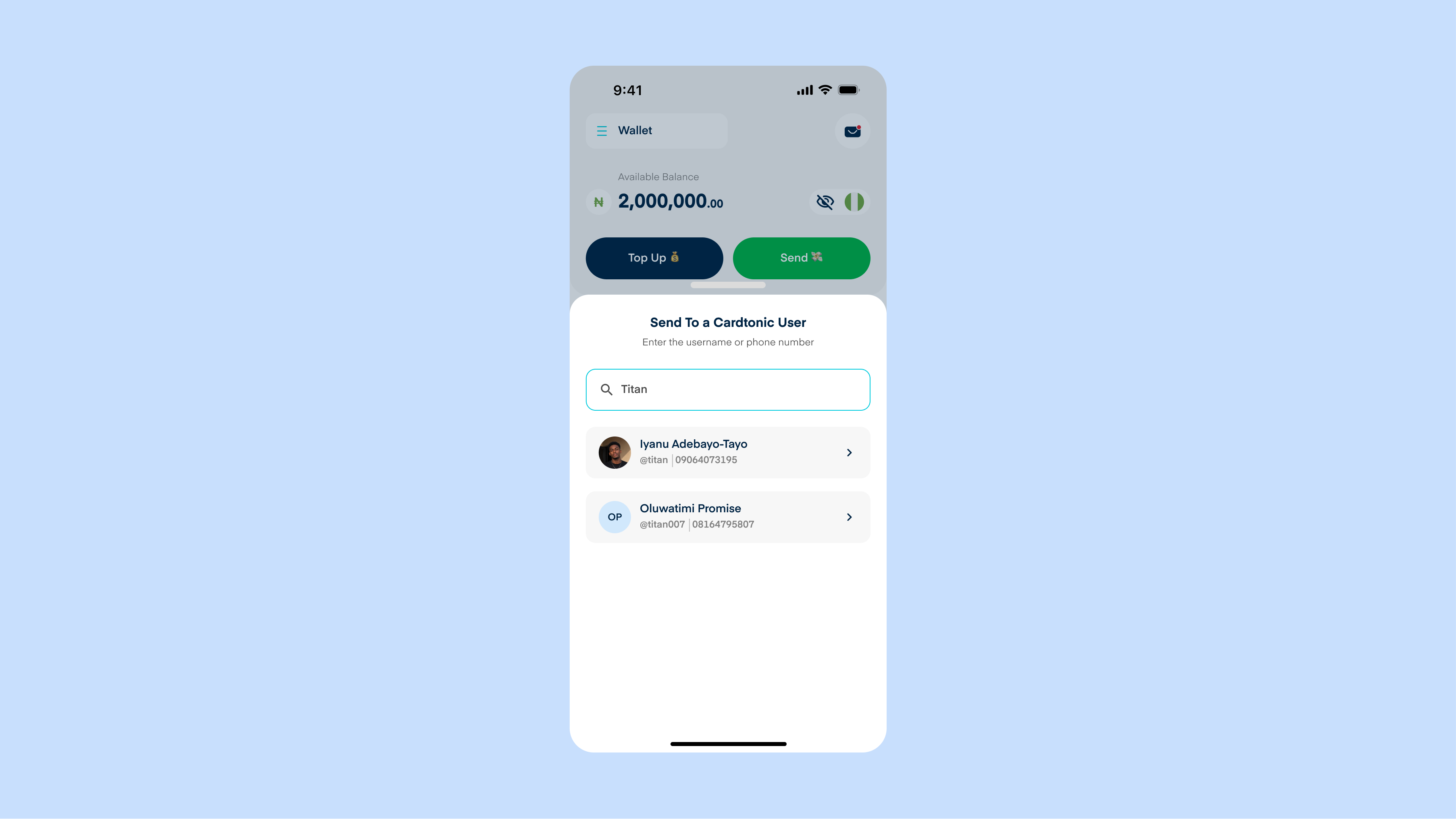
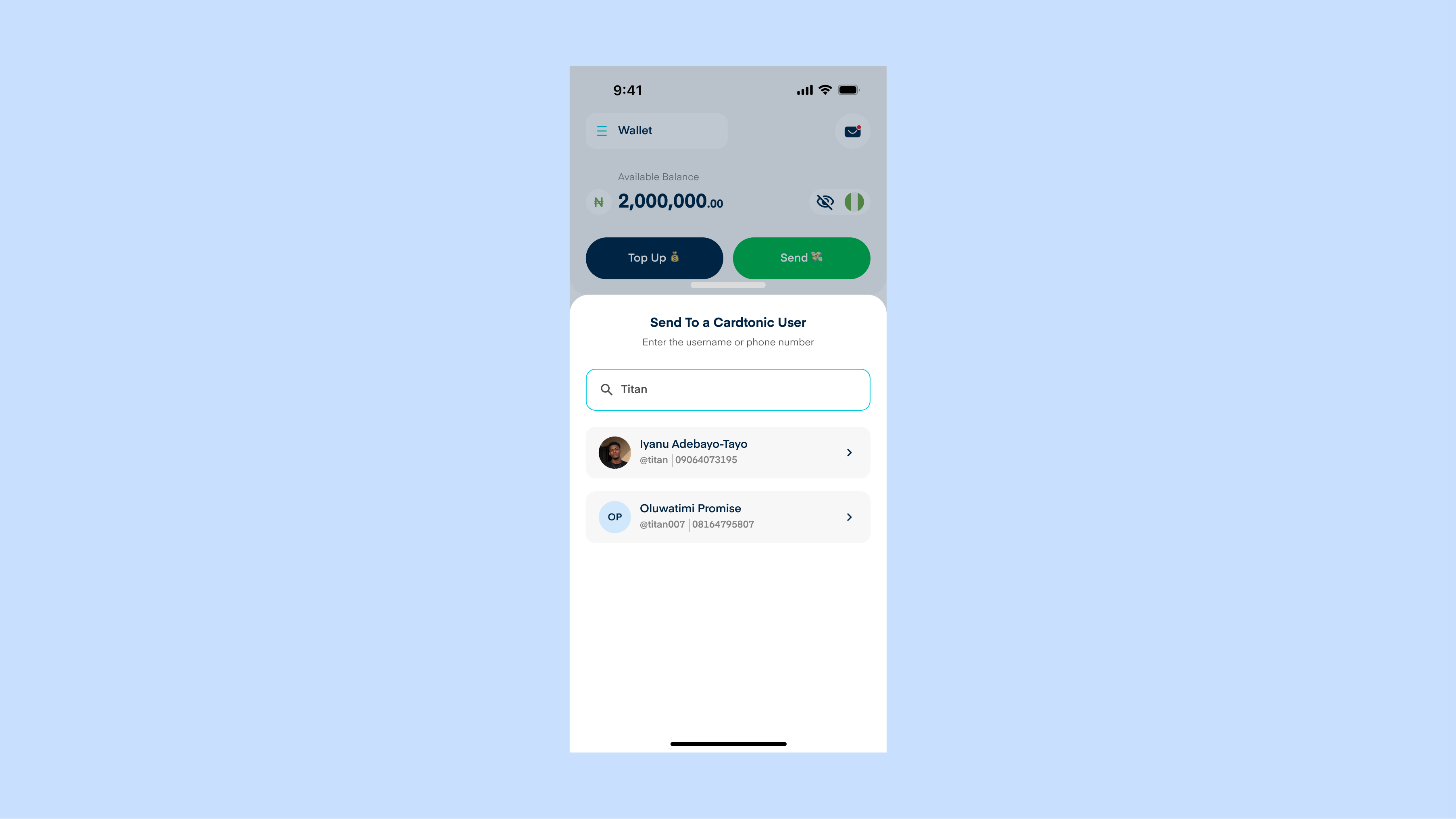
I reused familiar pages and navigation so the transfer would feel connected to the rest of the app. Sending began in Wallet, with search and recent recipients in a bottom sheet.
Once someone was selected, their details stayed visible through amount entry and review. The sender could keep checking who would receive the money without passing through another confirmation page.
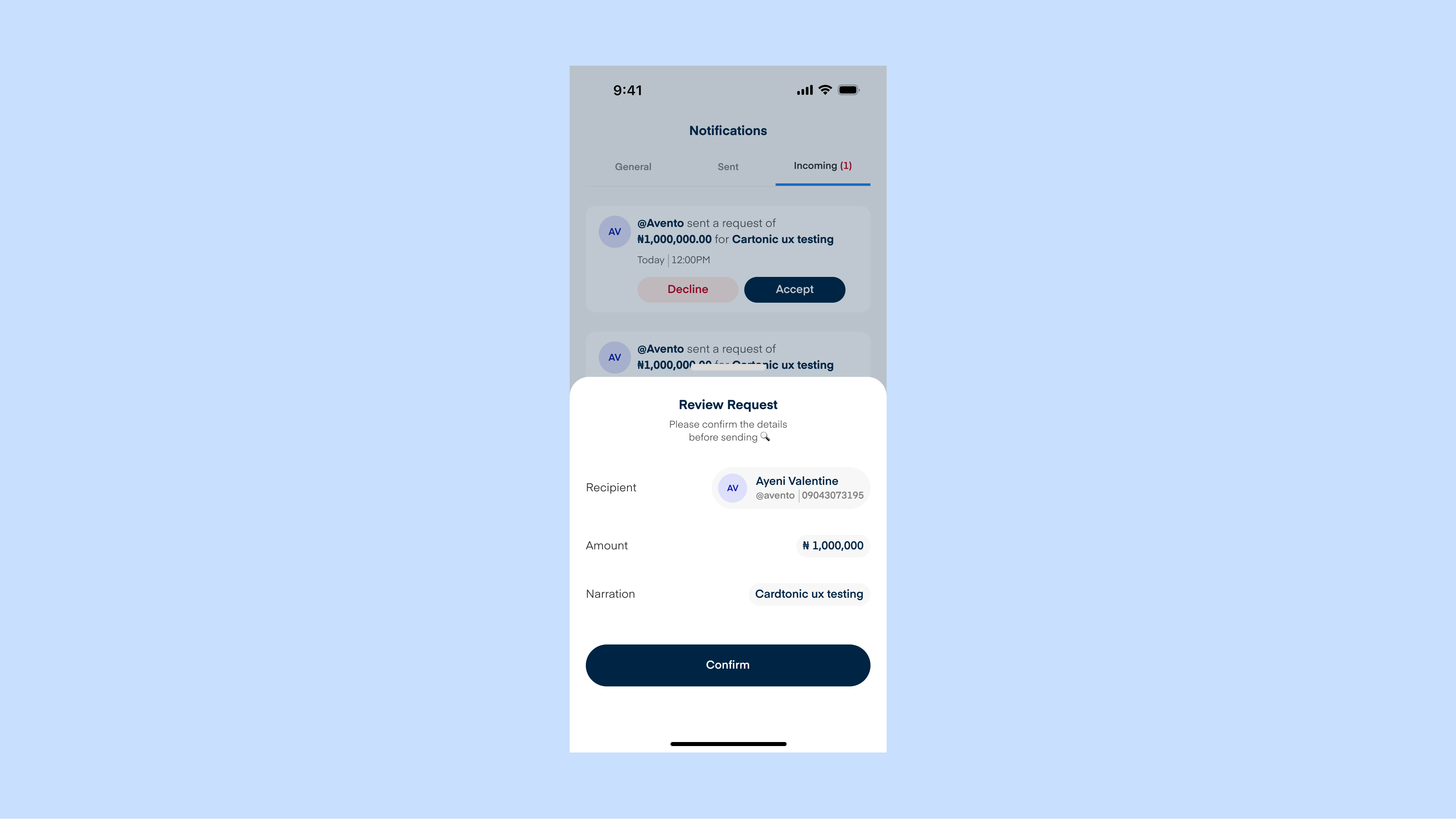
For the amount, I used prominent numerals, comma grouping and “Millions” as a second reading cue. I brought the recipient, amount and optional note together in a review sheet before PIN authorisation. This was the point where someone could inspect the whole payment before committing.


Making room for necessary friction
I wanted the transfer to feel straightforward, while giving people time to check decisions that mattered. In fintech, necessary friction is a deliberate step that helps someone avoid a costly mistake or allows the service to verify a potentially risky action.
The review screen was one such pause. It brought the recipient and amount together before the sender authorised the payment. I also explored when the system might need to ask for more assurance, such as a transfer from an unfamiliar device or activity that differed from the account’s usual pattern.
For those situations, I proposed an additional verification step after the PIN and before processing. It would explain why the check was needed, guide the sender through it and let them cancel the transfer. The conditions for triggering it would need to be defined with the team responsible for fraud and security.
That extra effort also has a cost. Camera access, poor connectivity or an inaccessible check could stop a genuine user. I would test those constraints and define alternative verification and recovery paths before introducing the step.

Making the outcome understandable
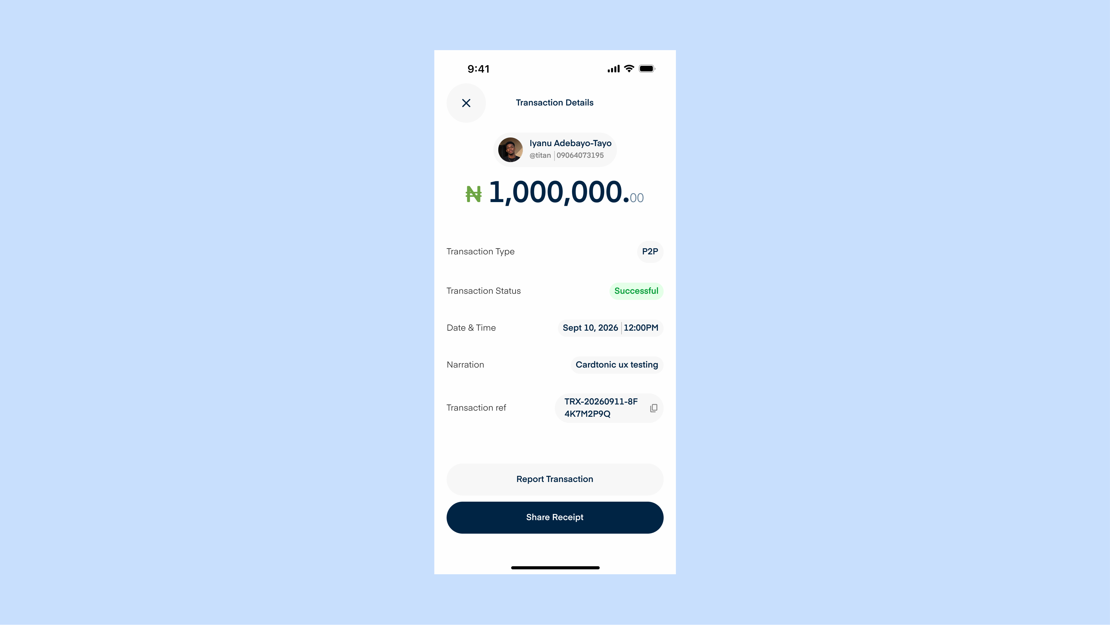
I connected review, PIN entry, processing and confirmation in the prototype. Processing communicated that the result was still pending. Confirmation repeated the amount and recipient, while transaction details provided a record and a way to report an issue.
That help route mattered to the trust question too. Its usefulness would depend on the support behind it. A reassuring interface could only go so far without reliable service.
Extending the idea to request money
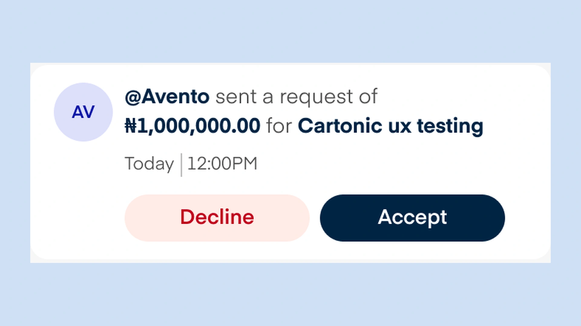
Request money introduced a different question of control. One person could ask for payment; the other needed to understand the request and choose whether to authorise it. I explored separate requester and payer journeys, with clearer status wording still needed to distinguish a request being accepted from money actually moving.
What I would take forward
The work produced a primary transfer prototype, complementary flows and reusable components. Working through them made continuity central to my approach: the recipient selected, the amount reviewed and the outcome shown should remain easy to connect.
I would test whether people could choose the intended recipient, catch an incorrect amount and understand what happened after authorisation. I would also test request discovery and verification recovery. Those findings would help establish whether the design supported the confidence I intended.